


Your product page is the digital equivalent of a sales assistant. It needs to inform, persuade, and guide shoppers towards the checkout with confidence. Yet many eCommerce stores lose sales because their product pages fail to communicate value clearly or address buyer concerns at the right moment. Building a high converting product page requires more than attractive visuals-it demands strategic design, compelling copy, and a deep understanding of customer psychology. For UK brands competing in crowded markets, every element on the page must earn its place by either reducing friction or building trust.
Why Product Page Performance Matters
Revenue doesn't come from traffic alone. Even stores with impressive visitor numbers struggle when their product pages fail to convert. The product page sits at the critical decision-making stage of the customer journey, where browsers become buyers or abandon carts entirely.
Conversion rate improvements on product pages create compound gains across your entire store. A 2% increase in product page conversions can mean thousands in additional monthly revenue without spending more on advertising. The math is straightforward: better product pages equal more sales from the same traffic.
Consider the alternative cost. Brands invest heavily in marketing to drive qualified visitors, only to watch them leave because a product page didn't answer their questions or build sufficient confidence. This represents wasted ad spend and lost opportunity.
Product pages also influence key metrics beyond immediate conversions:
- Time on site increases when content is engaging and informative
- Bounce rates decrease when pages meet visitor expectations
- Average order value grows through strategic cross-selling
- Return rates drop when product information sets accurate expectations
A well-optimized product page works harder than any individual marketing channel. It operates around the clock, converting visitors regardless of whether they arrived from social media, organic search, or paid advertising.
Core Elements of High Converting Product Pages
Product Photography That Sells
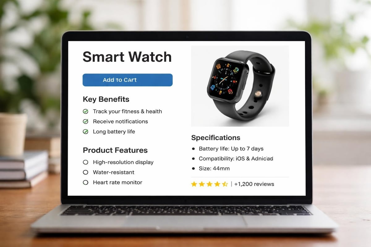
Visual content dominates purchasing decisions, particularly for products customers cannot physically touch. High-quality product photography serves as your primary persuasion tool, replacing the in-store experience with digital clarity.
Multiple angles matter. Shoppers want to see products from every perspective-front, back, sides, and detail shots that reveal texture and quality. Top-performing product pages typically feature six to eight images minimum, with luxury brands often showcasing fifteen or more.
Lifestyle photography contextualizes products within real-world scenarios. A photograph showing how a product fits into daily life creates emotional connections that sterile white-background shots cannot achieve. Show your furniture in styled rooms, your clothing on diverse body types, your tools being used in realistic settings.

Image TypePurposeConversion ImpactHero shotFirst impressionEstablishes quality perceptionMultiple anglesProduct understandingReduces uncertaintyLifestyle contextEmotional connectionIncreases desireDetail close-upsQuality verificationBuilds trustScale referenceSize clarityReduces returns
Video content outperforms static images for complex products. Demonstrations, unboxing experiences, and 360-degree views give shoppers confidence that they understand exactly what they're purchasing.
Persuasive Product Descriptions
Generic product descriptions kill conversions. Every sentence must earn its place by addressing customer needs, highlighting benefits, or overcoming objections. Your copy should speak directly to your target audience using language they recognize and value.
Lead with benefits, not features. Shoppers care about outcomes more than specifications. Instead of "600-thread count Egyptian cotton," write "Sleep better in sheets that stay cool and soften with every wash." Features support benefits but shouldn't dominate your opening paragraphs.
Writing effective product copy requires understanding your buyer's mindset at the moment they land on your page. What questions are they asking? What concerns prevent them from buying immediately? Address these proactively within your description.
Structure matters as much as content:
- Opening paragraph states the primary benefit
- Bullet points highlight key features and secondary benefits
- Detailed section covers specifications for research-focused buyers
- Final paragraph reinforces value and creates urgency
Avoid industry jargon unless your audience expects it. Technical specifications belong further down the page, after you've established why the product matters. Scannable formatting helps mobile shoppers consume information quickly without reading every word.
Strategic Call-to-Action Placement
Your add-to-cart button is the gateway to revenue. Its position, design, and surrounding elements directly influence conversion rates. On a high converting product page, the primary CTA remains visible and accessible without aggressive tactics that damage user experience.
Colour psychology influences CTA performance, but context matters more than theory. Your button needs sufficient contrast against its background whilst remaining consistent with your brand identity. Test bold colours, but prioritize visibility over arbitrary colour choices.
Multiple CTA placements serve long-form product pages. Place one above the fold for impulse buyers, another after your product description for those who need more information, and a final sticky button for mobile users scrolling through reviews.
The language surrounding your CTA builds or erodes confidence. Rather than generic "Add to Cart," consider context-specific variations:
- "Add to Bag" for fashion retailers
- "Start Your Order" for customizable products
- "Reserve Yours Now" for limited stock items
- "Try Risk-Free for 30 Days" when offering guarantees
Social Proof and Trust Signals
Customer reviews represent the single most powerful trust element on product pages. Shoppers trust peer experiences more than brand messaging, making reviews essential for conversion optimization. High-converting product pages display reviews prominently, often above the fold alongside product images.
Star ratings create instant credibility. Even before reading detailed reviews, shoppers assess aggregate ratings to gauge product quality. Display average ratings clearly near product titles, and show the total review count to demonstrate social validation at scale.
Different review types serve different purposes:
- Written reviews provide detailed experiences and address specific concerns
- Photo reviews prove product quality and show real-world appearance
- Video reviews build stronger emotional connections and trust
- Verified purchase badges distinguish genuine customers from potential fake reviews
Trust badges reduce purchase anxiety by signaling security and reliability. Display payment security icons, money-back guarantees, and shipping promises near your add-to-cart button. Industry certifications and awards strengthen credibility for premium products.
Returns policies belong on product pages, not buried in footer links. Generous return terms actually increase conversions by reducing perceived risk. If you offer free returns, make that prominently visible.
Advanced Optimization Techniques
Technical Performance Factors
Page speed directly impacts conversion rates. Every second of delay increases bounce rates and reduces sales. Creating high-converting product pages requires balancing visual richness with loading performance, particularly on mobile devices where connection speeds vary.
Image optimization delivers the greatest performance gains. Compress product photos without visible quality loss, implement lazy loading for images below the fold, and use modern formats like WebP for browsers that support them. Your hero image should load within the first second.
Mobile responsiveness isn't optional in 2026. Over 70% of eCommerce traffic comes from mobile devices, yet many stores still prioritize desktop experience. Your mobile product page must be as comprehensive and persuasive as its desktop counterpart, not a stripped-down version.
Test your pages on actual devices, not just browser simulators. Touch targets need adequate spacing, text must remain readable without zooming, and checkout processes should require minimal typing.
Personalization and Dynamic Content
Generic product pages convert less effectively than personalized experiences. Modern eCommerce platforms enable dynamic content based on referral source, geographic location, browsing history, and customer segments.
Show region-specific pricing and shipping estimates automatically. UK shoppers expect to see prices in pounds sterling with VAT included and estimated delivery dates relevant to their location. Nothing erodes trust faster than discovering unexpected costs at checkout.
Recently viewed items and related products extend browsing sessions. Strategic product recommendations can increase average order values by 10-30% whilst helping customers discover items they genuinely need. Position these suggestions logically within the page flow rather than overwhelming visitors with options.
For brands working with a specialist agency, Shopify CRO services can identify which personalization strategies deliver the strongest results for your specific audience through data-led testing and optimization.
Mobile-First Design Considerations
Mobile shoppers behave differently than desktop users. They're often browsing in spare moments, comparing options across multiple tabs, or making impulse purchases during commutes. Your mobile product page must accommodate these behaviours with streamlined navigation and accelerated decision-making paths.
Sticky elements keep critical information accessible as users scroll:
- Product price and discounts
- Add-to-cart button
- Stock availability status
- Key trust signals
Expandable sections reduce initial page length whilst keeping detailed information accessible. Use accordions for specifications, shipping information, and care instructions. This approach serves scanners whilst accommodating detail-seekers.
Content Strategy for Product Pages
Formatting for Scannability
Most shoppers scan rather than read. Your content structure must communicate key information through headings, bullet points, and visual hierarchy before readers commit to detailed paragraphs. A high converting product page guides attention deliberately through its most persuasive elements.
Bullet points increase information retention. Complex feature sets become digestible when broken into scannable lists. Each bullet should start with the benefit, followed by supporting detail if needed.
Whitespace prevents cognitive overload. Dense paragraphs intimidate mobile readers and reduce comprehension. Break content into short sections with breathing room between elements.
Strategic text formatting emphasizes critical information:
- Bold text for key benefits and specifications
- Italic text for subtle emphasis or quotations
- Larger fonts for section headings and guarantees
- Contrasting colours for time-sensitive offers
Addressing Buyer Objections
Every product category has predictable objections that prevent purchases. Anticipate and address these concerns directly within your product page content. Common objections include price, quality uncertainty, size/fit concerns, and shipping costs or timelines.
FAQ sections preemptively answer questions before they become obstacles. Rather than forcing shoppers to contact support, provide immediate answers about materials, dimensions, compatibility, care instructions, and warranty terms.
Size guides reduce returns for apparel and furniture. Interactive tools that help customers select the right size or configuration build confidence whilst reducing the operational costs of processing returns.
Comparison tables help shoppers understand how your product differs from alternatives. If customers are comparing you against competitors anyway, control that narrative by highlighting your differentiators clearly.
SEO Considerations for Product Pages
Product pages represent significant organic search opportunities. Shoppers searching for specific products or comparing options often land directly on product pages rather than homepages or category pages. Optimizing these pages for search visibility compounds their revenue impact.
Title tags should include product name, key feature, and brand. Keep titles under 60 characters whilst incorporating high-intent keywords naturally. Avoid keyword stuffing, which damages both rankings and click-through rates.
Meta descriptions don't directly influence rankings but significantly impact click-through rates from search results. Write compelling 145-150 character descriptions that communicate value and create urgency. For stores looking to improve search visibility systematically, understanding how Shopify and SEO work together provides foundational knowledge.
Product descriptions should incorporate semantic keywords naturally. Google understands context and related terms, rewarding comprehensive content over exact-match keyword repetition. Write for humans first, search engines second.
SEO ElementCharacter LimitPrimary PurposeTitle tag50-60 charactersSearch visibility and click-throughMeta description145-150 charactersClick-through rate from searchH1 headingNo strict limitPage topic clarityProduct description300+ wordsComprehensive information and keyword coverage
Schema markup helps search engines understand your product pages better. Product schema enables rich results showing price, availability, and ratings directly in search results, increasing click-through rates significantly.
Conversion Rate Optimization Testing
What to Test First
Not every element deserves immediate testing. Prioritize high-impact changes that affect the largest percentage of visitors or address obvious friction points. Start with elements above the fold, as these influence first impressions and immediate bounce decisions.
Primary image selection often yields surprising results. The product angle or lifestyle context that you prefer may not resonate with your audience. Test different hero images to discover which generates the strongest engagement.
CTA button variations deliver quick wins. Test colour, size, placement, and copy simultaneously or individually depending on traffic volume. Small changes to button prominence can produce 20-30% conversion increases.
Price presentation strategies influence perceived value. Test showing discounts as percentages versus absolute amounts, displaying RRP alongside sale prices, or highlighting payment plan options.
Establishing Testing Frameworks
Valid A/B testing requires statistical significance. Running tests for only a few days or with minimal traffic produces unreliable results that lead to poor decisions. Most product page tests need 2-4 weeks and hundreds of conversions per variation to reach confidence levels above 95%.
Test one element at time when traffic is limited. Multivariate testing requires substantially more visitors to produce reliable results. Single-variable tests take longer but provide clearer insights into what drives performance changes.
Document everything. Maintain records of what you tested, why you tested it, results achieved, and insights gained. This knowledge base prevents duplicate testing and helps identify patterns across multiple experiments.
Tools like Microsoft Clarity, Hotjar, or Lucky Orange provide qualitative data that complements quantitative A/B testing. Heatmaps reveal where users click, scroll maps show how far down pages people read, and session recordings expose unexpected friction points.
Measuring Success Beyond Conversion Rate
Conversion rate tells part of the story but shouldn't be your only metric. A change that increases conversions might also increase returns if it sets inaccurate expectations. Monitor multiple metrics simultaneously to understand true impact.
Average order value matters as much as conversion rate. Product page optimizations that encourage bundle purchases or higher-value alternatives generate more revenue than those focused solely on conversion rates.
Key metrics for comprehensive evaluation:
- Conversion rate - percentage of visitors who purchase
- Add-to-cart rate - engagement before purchase commitment
- Average order value - revenue per transaction
- Revenue per visitor - combined metric showing true impact
- Return rate - quality of conversions generated
- Time on page - engagement and information consumption
Cart abandonment rates reveal friction between add-to-cart and purchase completion. High abandonment suggests problems beyond the product page itself, often in checkout processes or unexpected shipping costs.
Building Consistency Across Your Store
Individual high converting product pages deliver results, but consistent optimization across your entire catalogue multiplies impact. Develop templates and standards that ensure every product receives the same strategic attention, regardless of category or price point.
Create style guides for product photography. Consistent visual presentation builds brand recognition and professional credibility. Specify lighting conditions, angles, background treatments, and lifestyle context requirements for all product categories.
Standardize description formats whilst allowing flexibility for category-specific needs. Fashion products require different information than electronics or home goods, but the structural approach should remain consistent.
Quality control processes catch errors before they impact sales. Regular audits identify missing images, incomplete descriptions, broken links, or outdated information. For growing stores, establishing comprehensive Shopify support ensures these elements receive ongoing attention as your catalogue expands.
Template improvements scale immediately across hundreds or thousands of products. When you optimize a product page template, every item using that template inherits the improvements. This creates leverage that individual page optimization cannot match.
Creating a high converting product page requires combining persuasive copywriting, strategic design, technical performance, and continuous optimization. Every element must work together to build confidence, communicate value, and reduce friction throughout the buying journey. Futur Media specializes in designing and optimizing Shopify stores that turn browsers into buyers through data-led CRO, performance-focused development, and user experiences built around how real customers shop. If your product pages aren't converting as they should, we'll help you identify what's holding back performance and implement changes that drive measurable revenue growth.