

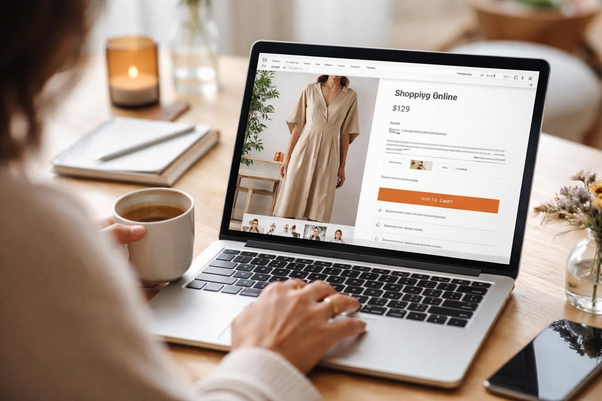
Your product page is where browsing becomes buying. It's the most critical real estate in your Shopify store, yet many UK brands treat it as an afterthought. The difference between a product page that converts at 1% and one that converts at 4% isn't luck-it's strategic shopify product page design. Every element, from your hero image to your CTA button, either builds trust and momentum or creates friction. For ambitious eCommerce brands, understanding what makes a product page work isn't optional. It's the foundation of profitable growth.
Why Product Page Design Matters More Than Ever
The average online shopper makes a purchase decision within seconds. Your product page needs to communicate value, build confidence, and remove objections faster than ever before.
Conversion rates live and die on product pages. A well-designed page doesn't just look good-it guides visitors through a psychological journey from curiosity to conviction. Poor design creates hesitation. Missing information triggers doubt. Slow load times cause abandonment.
Consider these critical factors:
- First impressions form in 50 milliseconds
- 75% of consumers judge credibility based on design
- Product pages account for the majority of eCommerce revenue
- Mobile traffic now exceeds 60% for most UK retailers
The stakes are high. When you're investing in Shopify web design, your product pages deserve the most attention. They're not just templates-they're your best salespeople, working 24/7 to convert traffic into revenue.
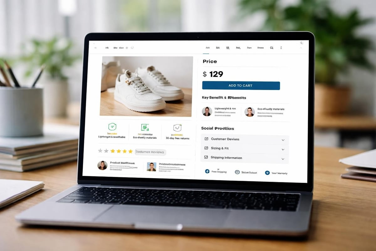
Essential Elements of High-Converting Product Pages
Every successful shopify product page design includes specific components that work together to drive conversions. Missing even one can cost you sales.
Product Images and Visual Hierarchy
Your hero image is the first thing visitors see. It needs to be sharp, professionally shot, and showcase your product in context.
Multiple angles matter. Shoppers can't touch your product, so they need to see it from every perspective. Include:
- Front, back, and side views
- Close-ups of textures and details
- Lifestyle shots showing the product in use
- Scale references where relevant
- Video demonstrations when possible
High-quality product photography increases conversion rates by up to 30%. Invest in professional imagery or ensure your in-house shots meet commercial standards. Compressed, optimised files maintain quality whilst protecting page speed-a crucial ranking factor that impacts both SEO and user experience.
Product Descriptions That Sell
Your description isn't just information-it's persuasion. The best shopify product page design balances features with benefits, addressing both logical and emotional buying triggers.
Structure your descriptions strategically:
- Lead with the primary benefit
- Support with key features
- Address common objections
- Include technical specifications
- End with a subtle urgency element
Avoid generic manufacturer descriptions. Write unique copy that speaks directly to your target customer's needs, pain points, and aspirations. Brands that prioritise strong product page layouts consistently outperform competitors using template content.
ElementPurposeImpactHero imageImmediate visual appealCreates first impressionBenefits-led copyEmotional connectionBuilds desireTechnical specsLogical justificationRemoves purchase barriersSocial proofTrust buildingValidates decision
Reviews and Social Proof
Trust is the currency of eCommerce. Product reviews, ratings, and customer photos transform your page from a sales pitch into a credible recommendation.
Display reviews prominently, ideally above the fold. Include:
- Star ratings visible immediately
- Recent customer photos
- Verified purchase badges
- Response to negative reviews
- Review count and average score
According to research, 93% of consumers read reviews before purchasing. Pages without reviews convert significantly lower than those with even moderate review volumes. Encourage reviews through post-purchase emails and make leaving feedback frictionless.
Layout and Structure Best Practices
The architecture of your shopify product page design determines how easily visitors can find information and move towards purchase.
Mobile-First Design Approach
With mobile commerce dominating UK eCommerce, your product pages must work flawlessly on smaller screens. This means:
- Vertical layouts that minimise horizontal scrolling
- Thumb-friendly buttons positioned within easy reach
- Compressed images that load instantly on 4G
- Simplified navigation reducing cognitive load
Test your pages on actual devices, not just browser emulators. Real-world performance reveals friction points that desktop testing misses. Mobile shoppers are often more intent-driven-optimise for speed and clarity.
Strategic Information Hierarchy
Visitors scan pages in predictable patterns. Position your most important elements where eyes naturally fall.
F-pattern layout works for product pages:
The eye moves left to right across the top, then down the left side, with occasional right-side glances. Place your product name, price, and primary CTA in this natural viewing path.
Don't bury critical information below the fold. Shipping costs, return policies, and stock availability should be immediately visible. Hidden friction points cause cart abandonment even when customers are ready to buy.
Colour Psychology and CTA Design
Your "Add to Cart" button isn't just functional-it's psychological. Button colour, size, copy, and positioning all influence conversion rates.
Testing reveals surprising insights:
- Contrasting colours outperform on-brand choices
- Action-oriented copy ("Add to Bag") beats generic text
- Larger buttons (to a point) increase clicks
- Sticky CTAs that follow scrolling boost mobile conversions
Run A/B tests on your CTA design. Small changes can yield significant improvements. The best Shopify product pages continuously test and refine based on actual user behaviour, not assumptions.
Advanced Features That Increase Conversions
Beyond the basics, sophisticated shopify product page design incorporates features that address specific objections and enhance the buying experience.
Size Guides and Fit Finders
For fashion and footwear brands, sizing uncertainty is the top conversion killer. Interactive size guides reduce returns whilst increasing purchase confidence.
Implement:
- Visual measurement guides with clear imagery
- Size recommendation tools based on customer input
- Fit information pulled from review data
- Comparison charts for international sizing
These tools serve double duty-they increase conversions whilst reducing costly returns from poor fit.
Stock Indicators and Urgency Elements
Scarcity drives action. Displaying low stock levels creates genuine urgency without resorting to manipulative tactics.
Show real-time inventory when stock is low. Use phrases like "Only 3 left" or "Back in stock soon" to communicate scarcity honestly. Combine with waitlist functionality for out-of-stock items-capturing demand you'd otherwise lose.
Urgency elements that work:
- Live stock counts below certain thresholds
- Recently purchased notifications
- Limited-time offers with countdown timers
- Seasonal availability messaging
Avoid fake urgency. Customers recognise manufactured scarcity, and it damages trust more than it drives sales.
Shipping and Returns Information
Unexpected costs at checkout cause 48% of cart abandonments. Make shipping costs, delivery times, and return policies crystal clear on your product pages.
Consider free shipping thresholds displayed dynamically: "Add £15 more for free delivery." This increases average order values whilst addressing the shipping cost objection before checkout.
Trust SignalImplementationConversion ImpactFree returnsBadge near CTA+12% conversionDelivery estimateDate range, not days+8% conversionSecure checkout badgePayment icons visible+15% trust scoreMoney-back guaranteeClear policy link+10% confidence
Technical Performance and SEO Considerations
Beautiful design means nothing if pages load slowly or don't rank. Technical excellence underpins successful shopify product page design.
Page Speed Optimisation
Every second of load time costs conversions. Pages loading in under 2 seconds convert significantly better than those taking 5+ seconds.
Speed optimisation priorities:
- Compress and lazy-load images
- Minimise JavaScript and CSS
- Enable browser caching
- Use Shopify's CDN effectively
- Eliminate render-blocking resources
Tools like Google PageSpeed Insights reveal specific bottlenecks. Address the highest-impact issues first. For brands serious about performance, working with specialists who understand both design and technical optimisation-like those offering Shopify development services-ensures your beautiful pages actually perform.
Structured Data and Rich Snippets
Product schema markup helps Google understand your offerings and display rich results in search. This increases click-through rates from organic search.
Implement schema for:
- Product name and description
- Price and currency
- Availability status
- Review ratings and count
- Brand information
Rich snippets make your listings stand out in search results with star ratings and pricing visible before clicks. This pre-qualifies traffic and improves conversion rates from organic visitors.
URL Structure and Metadata
Clean, descriptive URLs improve both SEO and user experience. Avoid auto-generated product IDs in URLs-use readable, keyword-rich slugs instead.
Your product page metadata needs equal attention. Title tags should include the product name and primary keyword. Meta descriptions should entice clicks whilst accurately describing what's on the page. For businesses investing in Shopify SEO strategies, product page optimisation delivers compounding returns as your catalogue grows.
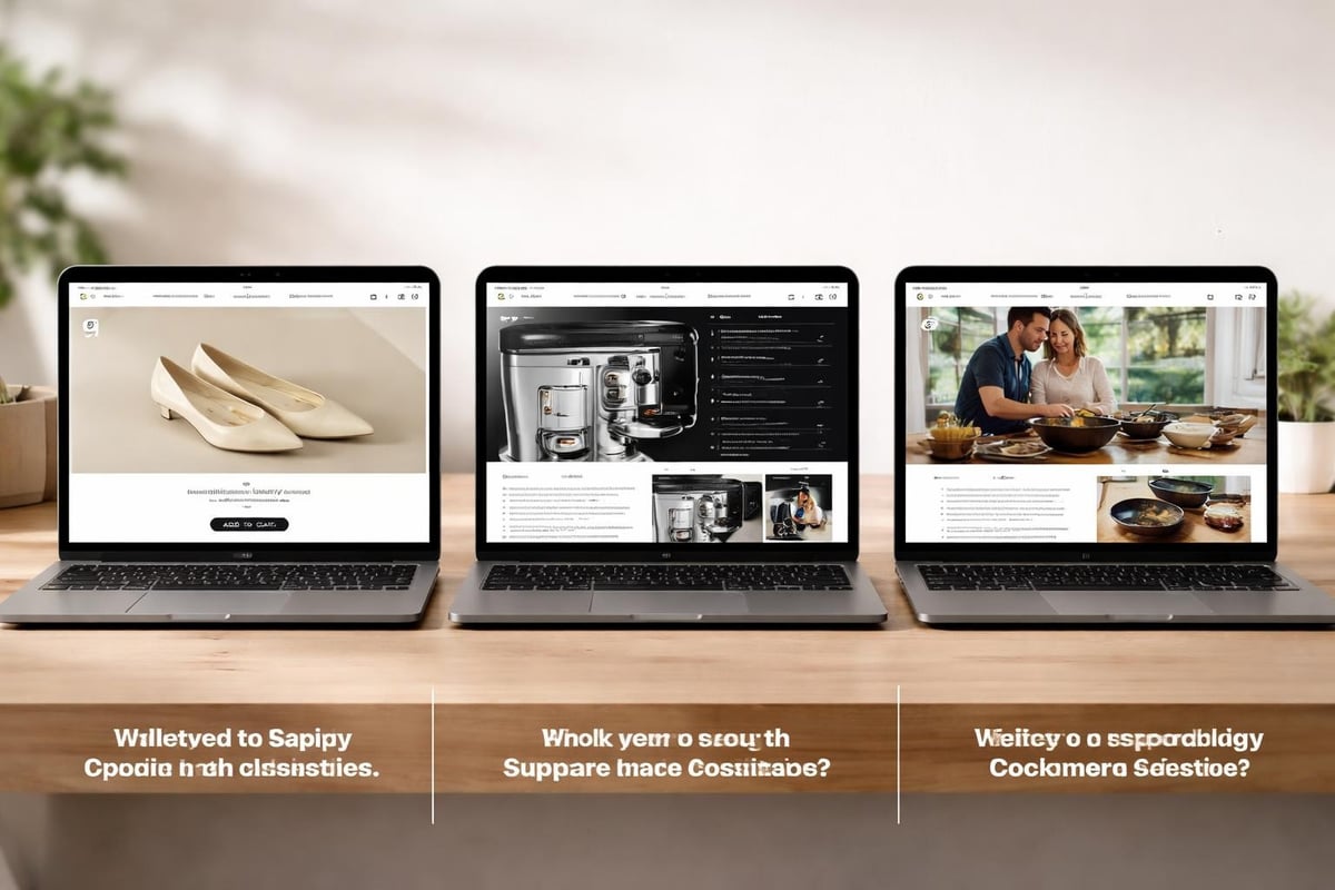
Real-World Examples and What Makes Them Work
Studying successful shopify product page design reveals patterns worth replicating. The brands that convert consistently share common approaches.
Minimalist Luxury Approach
Some brands strip everything to essentials-stunning photography, minimal copy, prominent pricing. This works for aspirational products where the image does the selling.
Key characteristics:
- Large, high-quality product images dominate
- White or neutral backgrounds
- Short, benefit-focused descriptions
- Clear typography hierarchy
- Generous whitespace
This approach suits premium brands where less truly is more. The design communicates quality through restraint.
Information-Rich Technical Pages
For complex products-electronics, equipment, professional tools-detailed specifications matter. These pages succeed through comprehensive information architecture.
Include tabbed content sections for specifications, compatibility, warranty information, and technical downloads. Customers buying technical products want data. Give them everything they need without overwhelming the initial view.
Examples of high-converting Shopify pages often feature expandable sections that reveal detail on demand. This satisfies both quick scanners and deep researchers.
Lifestyle and Storytelling Pages
Brands selling lifestyle products succeed by creating emotional connections. These pages blend aspiration with information.
Storytelling elements include:
- Lifestyle photography showing products in context
- Brand story integration
- Customer stories and testimonials
- Usage suggestions and styling ideas
- Related content and inspiration
This approach transforms product pages into editorial content. Customers don't just buy a product-they buy into a lifestyle and identity.
Testing and Continuous Improvement
The best shopify product page design evolves based on data, not opinions. Systematic testing reveals what actually works for your specific audience.
A/B Testing Framework
Test one element at a time to isolate impact. Common variables worth testing:
- CTA button colour and copy
- Image order and quantity
- Description length and format
- Review placement and prominence
- Price display and formatting
Run tests until statistical significance is reached-usually requiring thousands of sessions. Minor improvements compound over time. A 0.5% conversion lift might seem small, but across thousands of products and millions in revenue, it's substantial.
Heat Mapping and User Behaviour
Tools like Hotjar reveal how visitors actually use your pages. Heat maps show where people click, how far they scroll, and where they abandon.
Behaviour insights guide optimisation:
- Identify elements that attract attention
- Discover where visitors get stuck
- Find friction points causing exits
- Validate assumptions about layout
Combine quantitative data (conversion rates, bounce rates) with qualitative insights (heat maps, session recordings) for comprehensive understanding. This evidence-based approach beats guesswork every time.
Conversion Rate Benchmarking
Know your numbers. Track conversion rates by product, category, traffic source, and device. Identify patterns-which products convert well, which underperform?
Industry averages sit around 2-3% for eCommerce product pages. High performers achieve 4-6%. If you're significantly below average, systematic page improvements should be your priority. For brands looking at comprehensive optimisation, exploring conversion rate optimisation approaches alongside product page work delivers better overall results.
Common Mistakes to Avoid
Even experienced brands make preventable errors in shopify product page design. Recognising these pitfalls helps you avoid them.
Information Overload
More isn't always better. Cramming every possible detail into the initial view overwhelms visitors. Strategic information revelation works better.
Use progressive disclosure:
Present essential information immediately. Hide secondary details in expandable sections or tabs. Let customers control their information depth based on their needs and stage in the buying journey.
Neglecting Mobile Experience
Designing for desktop first often creates mobile experiences that feel like afterthoughts. Given mobile's dominance, this approach costs conversions.
Test on real devices regularly. What looks fine in responsive preview mode often reveals issues on actual phones. Button sizes, text legibility, and interaction patterns that work on desktop fail on mobile.
Weak or Generic Content
Using manufacturer descriptions or thin, keyword-stuffed copy undermines credibility. Customers recognise generic content instantly.
Invest in unique, compelling descriptions that speak to your specific audience. Address their pain points, highlight relevant benefits, and write in a voice that matches your brand. Quality content builds trust whilst improving SEO performance-a double benefit worth the investment.
Ignoring Load Times
Beautiful high-resolution images that take 10 seconds to load cost more in lost sales than they gain in visual appeal. Balance quality with performance.
Compress images aggressively. Use next-gen formats like WebP. Implement lazy loading. Monitor Core Web Vitals and treat them as conversion factors, not just SEO metrics.
Integration with Overall Store Design
Product pages don't exist in isolation. They're part of a broader customer journey that starts before arrival and continues after purchase.
Consistency Across the Store
Your product pages should feel cohesive with your homepage design, collection pages, and checkout. Inconsistent experiences create doubt.
Maintain visual consistency in:
- Typography and colour schemes
- Button styles and interactions
- Image treatments and quality
- Voice and messaging tone
This coherence builds brand recognition and trust. Customers moving through your store should feel like they're in one place, not clicking between disconnected templates.
Cross-Selling and Recommendations
Strategic product recommendations increase average order values without adding friction. Position them carefully to enhance rather than distract from the primary purchase.
Effective recommendation placements:
- Below the fold after primary content
- In a sidebar on desktop views
- After adding to cart confirmation
- On scroll, as engagement indicators
Personalised recommendations based on browsing history or purchase patterns convert better than generic "related products." The best Shopify apps for recommendations use AI to surface genuinely relevant suggestions, not just items from the same category.
Strategic shopify product page design directly impacts your bottom line, turning browsers into buyers through thoughtful layouts, compelling content, and friction-free experiences. Every element-from your hero image to your CTA button-either builds momentum towards purchase or creates hesitation. For ambitious UK brands ready to transform their Shopify store's performance, working with specialists who understand both design excellence and commercial results makes all the difference. Futur Media helps eCommerce businesses design, build, and optimise product pages that don't just look exceptional-they convert consistently and drive measurable growth.