.svg)


%201.png)
Creating a successful eCommerce presence requires more than simply setting up a shop. When you design website Shopify, you're building a digital storefront that needs to attract visitors, communicate trust, showcase products effectively, and guide customers smoothly towards purchase. The platform offers powerful tools and flexibility, but transforming those capabilities into a conversion-focused store demands strategic planning, attention to user experience, and technical understanding. Whether you're launching a new brand, redesigning an existing store, or migrating from another platform, the design decisions you make today will directly impact revenue, customer satisfaction, and long-term growth.
Understanding Shopify's Design Ecosystem
Shopify provides multiple pathways for creating your store's visual identity and functionality. The platform's theme architecture separates content from presentation, allowing you to customise appearance without compromising core functionality.
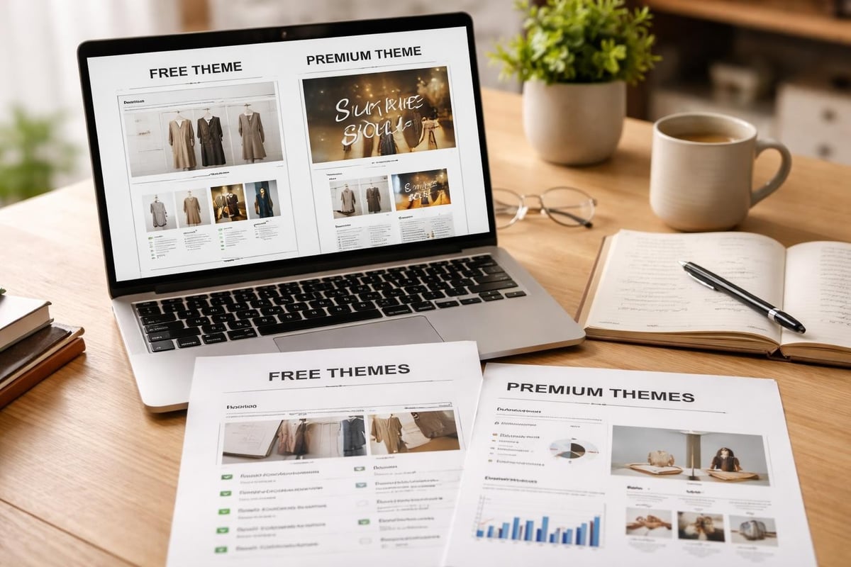
Theme Options and Selection Strategy
Choosing the right foundation is critical when you design website Shopify. The Shopify Theme Store offers both free and premium themes, each built to serve specific business models and industries.
Free themes provide solid foundations for new businesses:
- Dawn (modern, performance-focused default theme)
- Craft (minimal aesthetic for lifestyle brands)
- Sense (product-first layout for catalogues)
Premium themes offer advanced features and customisation:
- Prestige (luxury brands with large catalogues)
- Impulse (storytelling and high-impact visuals)
- Motion (video-first product presentations)
- Empire (high-volume stores with filtering needs)
When selecting a theme, prioritise these factors: mobile responsiveness, page speed scores, customisation flexibility, regular updates from developers, and alignment with your brand positioning. According to Shopify's theme best practices, well-structured themes maintain clean code, optimise asset loading, and follow accessibility standards.
Customisation Approaches
Once you've selected a base theme, customisation brings your brand identity to life. Shopify offers tiered customisation options depending on technical expertise and budget.
Customisation LevelTools UsedBest ForTechnical Knowledge RequiredTheme EditorShopify AdminBasic branding, colour changesNonePage BuildersApps like Shogun, GemPagesCustom layouts without codeMinimalLiquid EditingCode editorAdvanced customisationModerateCustom DevelopmentComplete rebuildUnique functionalityAdvanced
The theme editor allows non-technical users to adjust colours, fonts, section layouts, and content blocks. Page builder apps extend capabilities with drag-and-drop interfaces for creating custom pages. For brands requiring unique functionality or complete design control, Shopify development provides bespoke solutions built on the platform's latest technical capabilities.
Homepage Design Fundamentals
Your homepage serves as the digital reception area. When visitors arrive, they make split-second judgements about credibility, product relevance, and whether to explore further.
Above-the-Fold Strategy
The content visible before scrolling determines whether visitors stay or bounce. Effective above-the-fold design includes a compelling value proposition, high-quality hero imagery or video, primary call-to-action, and trust indicators like secure checkout badges or customer counts.
Research from top-performing Shopify stores demonstrates that clarity beats cleverness. Visitors should understand what you sell, who it's for, and why they should care within three seconds.
Essential above-the-fold elements:
- Clear brand identity and logo
- Navigation that maps to customer thinking
- Hero section with primary benefit statement
- Strong visual that demonstrates product or lifestyle
- Prominent call-to-action with specific language
Navigation Architecture
Navigation design directly affects discoverability and conversion rates. Well-structured navigation anticipates customer questions and buying journeys rather than mirroring internal category structures.
Consider these navigation patterns:
- Mega menus for stores with extensive catalogues
- Collections-based navigation organised by use case or customer type
- Product-type hierarchy for technical or specification-driven purchases
- Lifestyle categories for fashion and home goods
Mobile navigation requires special attention when you design website Shopify. With over 70% of eCommerce traffic coming from mobile devices, collapsed menus must remain intuitive and searchable. According to best practices from leading Shopify agencies, successful mobile navigation includes visible search, simplified category structures, and quick access to account and cart.
Social Proof and Trust Elements
Building credibility requires strategic placement of trust signals throughout the homepage. These elements reduce purchase anxiety and encourage deeper engagement.
Display customer reviews prominently, showcase press mentions or awards, highlight security badges near CTAs, feature customer counts or milestone achievements, and include authentic user-generated content. The psychology of social proof works best when specific and recent. Rather than "thousands of happy customers," use "2,847 five-star reviews this month."
Product Page Optimisation
Product pages carry the conversion weight. Even with excellent traffic and homepage engagement, poor product page design destroys sales potential.
Visual Hierarchy and Imagery
Product photography quality and presentation directly correlate with conversion rates. Professional imagery should include multiple angles, lifestyle context, detail shots, scale reference, and variant options clearly displayed.
Image optimisation checklist:
- High resolution (1200px minimum width)
- Compressed for fast loading (WebP format preferred)
- Consistent aspect ratios across catalogue
- Zoom functionality enabled
- Alt text for accessibility and SEO
Video significantly boosts conversion when showing product use, demonstrating scale or fit, explaining complex features, or building emotional connection. When you design website Shopify for maximum conversion, allocate budget towards quality visual content before additional features.
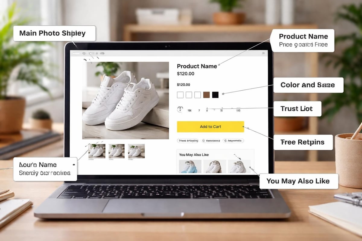
Product Information Architecture
Information presentation affects both conversion and returns. Customers need specific details organised logically to make confident purchase decisions.
Structure product information in this priority order:
- Product name and price (including any discounts)
- Short benefit-focused description
- Variant selectors (size, colour, material)
- Quantity selector and add-to-cart button
- Key features as scannable bullet points
- Detailed specifications (expandable sections)
- Shipping information and return policy
- Customer reviews and ratings
Expandable accordions reduce visual clutter whilst keeping detailed information accessible. This approach works particularly well for technical products, clothing with extensive size guides, or items requiring care instructions.
Variant Selection and Stock Display
Variant presentation affects both usability and conversion. Colour swatches work better than dropdowns for visual products. Size selectors should indicate availability and potentially show "low stock" warnings to create urgency.
Effective variant displays include:
- Visual swatches for colours and patterns
- Size guides linked near size selectors
- Clear indication of unavailable options
- "Notify when available" for out-of-stock variants
- Price changes reflected immediately
Mobile-First Design Principles
Mobile commerce now dominates eCommerce traffic and sales. When you design website Shopify, mobile experience cannot be an afterthought.
Touch-Optimised Interface Elements
Mobile interfaces require larger touch targets, adequate spacing between interactive elements, and thumb-friendly placement of key actions. Buttons should be minimum 44×44 pixels, with surrounding whitespace to prevent mis-taps.
Primary actions like "Add to Cart" should sit within easy thumb reach on larger phones. Navigation, search, and cart access belong in sticky headers or bottom bars for constant availability. Mobile-first design principles prioritise speed, simplicity, and progressive disclosure of information.
Simplified Mobile Checkout
Mobile checkout presents unique challenges. Smaller screens, on-screen keyboards, and touch input require streamlined processes.
Optimise mobile checkout through:
- Autofill support for addresses and payment
- Minimal form fields (only essential information)
- Single-column layouts
- Large, clear form inputs
- Express checkout options (Shop Pay, Apple Pay, Google Pay)
- Guest checkout availability
- Progress indicators for multi-step processes
Performance and Speed Optimisation
Page speed directly impacts conversion rates and SEO rankings. Research consistently shows that every additional second of load time reduces conversions by approximately 7%.
Technical Performance Factors
When you design website Shopify, numerous factors influence loading speed. Image optimisation remains the most impactful improvement for most stores.
Performance FactorImpact LevelImplementation DifficultyImage compressionHighEasyLazy loadingHighEasyApp script reductionVery HighModerateTheme code optimisationHighAdvancedCDN usageMediumAutomatic (Shopify)Browser cachingMediumAutomatic (Shopify)
Prioritise these optimisations:
- Compress all images before uploading (use tools like TinyPNG)
- Implement lazy loading for below-fold images
- Audit installed apps and remove unused ones
- Minimise custom fonts (limit to 2-3 typefaces)
- Defer non-critical JavaScript
- Optimise theme code (remove unused sections)
Shopify handles server infrastructure and CDN delivery, but theme choice and customisation significantly affect performance. According to TechRadar's Shopify review, the platform's hosting infrastructure provides reliable uptime, but store owners must optimise their implementation for speed.
Monitoring and Testing
Regular performance monitoring identifies issues before they impact revenue. Use Google PageSpeed Insights, Shopify's online store speed report, GTmetrix for detailed analysis, and real-user monitoring through Google Analytics.
Test across multiple devices and connection speeds. Your store might load quickly on office WiFi but crawl on mobile networks. Tools like Chrome DevTools allow throttling to simulate slower connections.
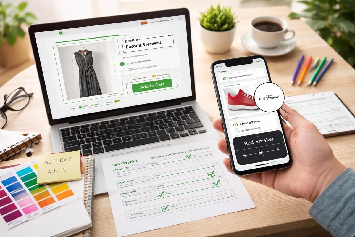
Accessibility and Inclusive Design
Accessible design serves everyone better whilst expanding your potential customer base. When you design website Shopify with accessibility in mind, you create experiences that work for users with visual, motor, cognitive, or auditory differences.
Core Accessibility Principles
WCAG (Web Content Accessibility Guidelines) provides standards for accessible web experiences. Key principles include:
- Perceivable: Content available through multiple senses
- Operable: Navigation possible via keyboard and assistive devices
- Understandable: Clear language and predictable behaviour
- Robust: Compatible with assistive technologies
Practical accessibility improvements:
- Sufficient colour contrast (minimum 4.5:1 for text)
- Alt text for all images
- Keyboard navigation support
- Clear focus indicators
- Descriptive link text
- Form labels properly associated
- Video captions and transcripts
- Heading hierarchy that makes logical sense
These improvements benefit all users whilst ensuring legal compliance and expanding market reach. For guidance on building accessible eCommerce experiences, explore insights from leading UK Shopify agencies that prioritise inclusive design.
Conversion Rate Optimisation Through Design
Design decisions directly influence conversion rates. Strategic improvements based on user behaviour data can dramatically increase revenue from existing traffic.
Strategic Call-to-Action Design
CTAs require prominence, clarity, and urgency. Button design affects click-through rates through colour psychology, size and position, action-oriented text, surrounding whitespace, and visual contrast.
High-converting CTA patterns:
- Single primary CTA per screen section
- Action verbs ("Start Shopping," "Get Yours," "Add to Bag")
- Contrasting colours that stand out from brand palette
- Repetition at logical decision points
- Progressive disclosure (next steps clear after action)
Trust and Urgency Mechanisms
Psychological triggers influence purchase decisions. Ethical use of urgency and scarcity can improve conversion without manipulating customers.
Effective trust builders include security badges near checkout, money-back guarantees, free shipping thresholds, estimated delivery dates, and authentic customer reviews. Urgency tactics work when genuine: limited stock warnings for actually scarce items, countdown timers for real promotions, and seasonal availability for time-limited products.
Avoid false scarcity or pressure tactics. These damage brand reputation and customer relationships long-term. The goal is reducing genuine purchase anxiety, not creating artificial pressure.
A/B Testing and Iteration
Design improvements require validation through testing. A/B testing compares variations to identify what actually increases conversions versus what merely looks better.
Test one variable at a time: homepage hero messaging, product page layout variations, checkout flow optimisation, navigation structure changes, or CTA button colours and copy. Shopify apps like Google Optimize integrate seamlessly for testing. Run tests until statistical significance is reached, typically requiring hundreds of conversions per variation.
Brand Consistency and Visual Identity
Your Shopify store exists within a broader brand ecosystem. Design consistency across touchpoints builds recognition and trust.
Visual Design Systems
Establishing design systems ensures consistency across your store. Document colour palettes (primary, secondary, accent, neutral shades), typography hierarchy (headings, body, captions, labels), spacing scales, button styles, icon sets, and image treatment guidelines.
These systems allow team members and agencies to make design decisions that maintain brand coherence. When working with Shopify web design specialists, comprehensive brand guidelines accelerate development whilst ensuring the final store reflects your vision accurately.
Multi-Channel Consistency
Your Shopify store should align visually with other brand touchpoints: social media profiles, email marketing templates, packaging and inserts, physical retail (if applicable), and marketing materials. Customers interact with brands across multiple channels before purchasing. Visual consistency across these touchpoints builds familiarity and credibility.
Advanced Features and Functionality
Beyond core commerce functionality, strategic features can differentiate your store and enhance user experience.
Personalisation and Recommendations
Product recommendations increase average order value and improve discovery. Shopify's built-in recommendation engine analyses purchase patterns to suggest relevant products.
Effective recommendation placements:
- Recently viewed products
- Frequently bought together
- Complementary items on product pages
- Personalised homepage sections for returning visitors
- Post-purchase cross-sells
Apps like LimeSpot and Rebuy provide advanced personalisation based on browsing behaviour, purchase history, and customer segments.
Search and Filtering
Search functionality becomes critical as catalogue size grows. Shopify's native search works adequately for small catalogues, but larger stores benefit from enhanced search apps.
Effective search features include autocomplete suggestions, typo tolerance, synonym recognition, filtering by multiple attributes, visual search (image-based), and search result personalisation. For stores with extensive catalogues, investing in smart search significantly improves user experience and conversion rates. Shopify apps specialising in search can transform product discovery.
Customer Accounts and Loyalty
Customer accounts enable repeat purchase optimisation. Well-designed account areas make reordering simple, store preferences, track orders, and manage subscriptions if applicable.
Loyalty programmes integrated into your store design encourage repeat business. Apps like Smile.io or LoyaltyLion provide points systems, referral programmes, and VIP tiers that reward ongoing engagement.
Ongoing Optimisation and Maintenance
Design isn't a one-time project. Successful stores evolve based on performance data, customer feedback, and changing market conditions.
Analytics and User Behaviour Tracking
Understanding how visitors interact with your store identifies improvement opportunities. Google Analytics reveals traffic sources, behaviour flow, conversion funnels, and drop-off points. Heatmap tools like Hotjar show where users click, how far they scroll, and where attention focuses.
Key metrics to monitor:
- Bounce rate by page and traffic source
- Time on site and pages per session
- Cart abandonment rate
- Conversion rate by device type
- Product page engagement
- Search usage and failed searches
These insights guide design iterations. If mobile conversion lags desktop significantly, mobile UX requires attention. High cart abandonment might indicate checkout friction or unexpected costs.
Seasonal Updates and Refreshes
Regular visual updates maintain freshness and accommodate seasonal promotions. Plan design refreshes around key commercial periods: sale events, seasonal collections, product launches, and brand milestones.
These updates needn't require complete redesigns. Strategic banner changes, homepage rearrangement, promotional sections, and seasonal colour adjustments keep the store feeling current without disrupting core functionality.
Building a successful eCommerce presence requires strategic design thinking, technical execution, and ongoing optimisation. Every element from theme selection through checkout flow contributes to either friction or conversion. If you're looking to launch a new store, redesign an existing presence, or migrate from another platform whilst protecting your SEO and performance, Futur Media specialises in creating Shopify stores that balance beautiful design with commercial results. We work with ambitious UK brands to build eCommerce experiences that convert visitors into customers and support long-term growth.