

.webp)


Your checkout page is where transactions happen, revenue is realised, and brands either win or lose customers. For UK eCommerce businesses, the Shopify checkout page represents the most critical moment in the entire customer journey. It's not just a form; it's a conversion engine that requires careful design, strategic optimisation, and continuous refinement. Getting this final step right can dramatically increase revenue, reduce cart abandonment, and create a seamless experience that encourages repeat purchases. This guide explores how ambitious brands can transform their checkout process into a competitive advantage through smart UX, technical optimisation, and conversion-focused design principles.
Understanding the Shopify Checkout Architecture
Shopify provides merchants with a robust checkout system built on years of conversion data and transactional expertise. The platform handles billions in sales annually, and this infrastructure powers checkout pages for businesses of all sizes.
The checkout experience operates across three core stages: customer information, shipping selection, and payment processing. Each stage presents unique opportunities for optimisation and potential friction points that can derail conversions.
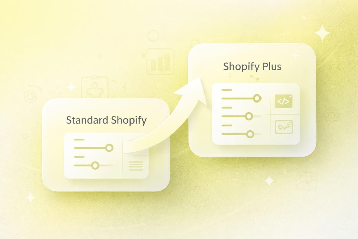
Standard Versus Customisable Elements
Different Shopify plans offer varying levels of checkout customisation. Shopify Basic and Shopify plans provide limited styling options, whilst Shopify Plus merchants gain access to advanced customisation through checkout.liquid and Scripts Editor.
Standard customisation options include:
- Logo placement and branding colours
- Banner messaging and promotional copy
- Form field configuration
- Typography and button styling
- Trust badges and security icons
More advanced customisation requires technical development work. This typically involves editing checkout scripts, adding custom fields, implementing conditional logic, or integrating third-party applications that enhance functionality.
Hosted Checkout Benefits
Shopify's hosted checkout solution manages security, compliance, and performance automatically. The platform maintains PCI DSS compliance, handles server infrastructure, and optimises load times globally through content delivery networks.
This hosted approach removes technical burden from merchants whilst ensuring consistent reliability. Shopify manages updates, security patches, and infrastructure scaling without requiring merchant intervention.
Designing for Conversion: Layout and Visual Hierarchy
The visual design of your Shopify checkout page directly influences completion rates. Strategic layout decisions guide customers through the purchase process with minimal friction and maximum confidence.
Effective checkout design prioritises clarity over creativity. The goal is to remove distractions, reduce cognitive load, and present information in a logical sequence that feels natural and trustworthy.
Single-Column Versus Multi-Column Layouts
Single-column layouts generally outperform multi-column designs in checkout environments. This vertical structure creates a clear path forward, reducing eye movement and maintaining focus on form completion.
Layout TypeAdvantagesBest ForSingle ColumnClear progression, mobile-friendly, reduced distractionMost eCommerce stores, mobile-first brandsMulti-ColumnShows order summary alongside forms, desktop optimisedHigh AOV stores, B2B checkoutsHybridResponsive adaptation based on deviceBrands with diverse customer segments
The order summary placement matters significantly. Sticky sidebars keep purchase details visible during form completion, whilst collapsible summaries work better on mobile devices where screen space is limited.
Progress Indicators and Transparency
Visual progress indicators reduce abandonment by setting clear expectations about remaining steps. Multi-page checkouts benefit most from numbered steps or progress bars that show completion status.
Effective progress indicators should:
- Display total steps clearly
- Highlight current position
- Allow backward navigation
- Use descriptive labels rather than generic terms
- Remain visible throughout the process
Transparency extends beyond progress tracking. Displaying all costs upfront, including shipping and taxes, prevents surprise abandonment at the payment stage. Hidden fees remain the primary reason customers abandon otherwise smooth checkout experiences.
Optimising Form Fields and Data Collection
Form design represents the technical heart of checkout optimisation. Every field adds friction, yet collecting insufficient information creates fulfilment problems and customer service headaches.
The challenge lies in balancing business needs with user experience. Strategic form design minimises input whilst capturing essential transaction data.
Field Reduction Strategies
Minimising form fields accelerates completion and reduces abandonment. Address autocomplete functionality can eliminate multiple manual inputs by populating city, county, and postcode fields automatically.
Remove optional fields entirely rather than marking them optional. If information isn't essential for order fulfilment, don't request it during checkout. Post-purchase emails can collect additional details for marketing purposes without jeopardising the sale.
Essential checkout fields:
- Full name (single field preferred over separate first/last)
- Email address
- Delivery address
- Contact phone number
- Payment information
Some brands experiment with post-code lookup tools that retrieve full addresses from minimal input. This technology works particularly well for UK customers familiar with this approach from other online services.
Smart Form Validation and Error Handling
Real-time validation provides immediate feedback when customers make input errors. Inline validation should appear as users complete fields, not after form submission when corrections feel more frustrating.
Error messages must be specific and helpful. Instead of "Invalid address," provide actionable guidance like "Please include a house number or building name." Clear communication transforms potentially frustrating moments into guided corrections.
Mobile considerations demand special attention to input types. Number keyboards should appear for phone fields, whilst email keyboards include @ symbols prominently. These small optimisations significantly improve mobile completion rates.
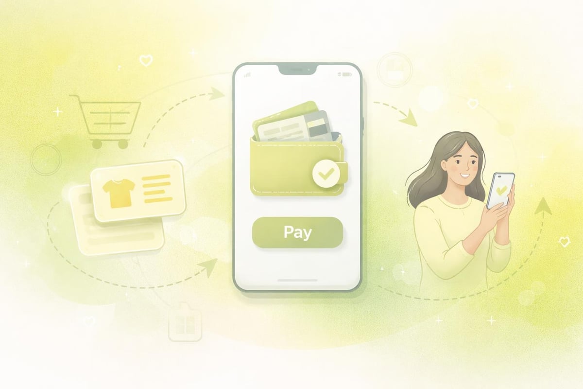
Accelerated Payment Methods and Express Checkout
Payment flexibility has evolved dramatically in recent years. Modern Shopify checkout pages must accommodate diverse payment preferences whilst maintaining security and reliability. For brands focused on conversion optimisation, understanding how Shopify CRO techniques apply to payment methods can unlock significant revenue gains from existing traffic.
Express checkout options allow customers to bypass traditional form completion entirely. These accelerated paths suit returning customers and those using digital wallets or stored payment information.
Digital Wallet Integration
Shop Pay, Apple Pay, Google Pay, and PayPal offer one-click purchasing for customers with stored payment credentials. These options should appear prominently above traditional checkout forms.
Benefits of express checkout:
- Reduced completion time
- Lower abandonment rates
- Higher mobile conversion
- Improved customer satisfaction
- Increased impulse purchases
Position express payment buttons above the fold on cart and product pages. Visual prominence signals availability and encourages adoption among customers who prefer these methods.
Buy Now, Pay Later Services
Instalment payment options have become standard expectations rather than premium features. Klarna, Clearpay, and similar services appeal particularly to younger demographics and higher-value purchases.
Display instalment messaging throughout the shopping journey, not just at checkout. Product pages, cart summaries, and promotional banners should communicate payment flexibility before customers reach the final stage.
Transparent messaging about interest rates, repayment schedules, and approval requirements builds trust. Customers should understand payment terms before initiating the BNPL process.
Mobile Checkout Optimisation
Mobile commerce dominates UK eCommerce traffic, yet mobile conversion rates typically lag desktop performance. The Shopify checkout page must function flawlessly on smartphones and tablets to capture this significant revenue opportunity.
Mobile optimisation extends beyond responsive design. Touch targets, input methods, and information hierarchy require specific consideration for smaller screens and different interaction patterns.
Touch-Friendly Interface Elements
Buttons and clickable elements should measure at least 44x44 pixels to accommodate finger taps accurately. Insufficient spacing between interactive elements causes frustration and accidental selections.
Form inputs benefit from generous padding and clear active states. When a field receives focus, visual feedback should clearly indicate which input is active, preventing confusion on smaller screens.
Mobile checkout essentials:
- Large, tappable buttons
- Sticky "Continue" or "Pay Now" buttons
- Auto-advancing form fields
- Appropriate keyboard types
- Minimal scrolling requirements
Auto-advance functionality moves focus to the next field after completing fixed-length inputs like postcodes or card numbers. This subtle enhancement creates momentum and reduces manual navigation.
Reducing Mobile Abandonment
Mobile checkout optimisation requires addressing device-specific friction points. Long forms feel more burdensome on mobile, making field reduction even more critical for smartphone shoppers.
Guest checkout options become particularly important on mobile devices where password retrieval feels more cumbersome. Forced account creation during checkout significantly increases mobile abandonment rates.
Autofill compatibility ensures saved payment information and addresses populate correctly. Testing across different browsers and devices identifies compatibility issues that may block form completion.
Trust Signals and Security Communication
Checkout pages represent vulnerable moments in the customer journey. Shoppers share sensitive financial information with brands they may have never purchased from before. Effective trust-building transforms hesitation into confidence.
Security communication must be visible without overwhelming the purchase interface. Strategic placement of trust signals reassures customers whilst maintaining focus on transaction completion.
Essential Trust Elements
Security badges, SSL indicators, and payment processor logos demonstrate transaction safety. Position these elements near payment fields where security concerns peak.
Trust SignalPlacementImpactSSL Certificate LockBrowser address bar (automatic)Essential baseline securityPayment BadgesBelow payment fieldsReassures card data safetyMoney-Back GuaranteeNear total priceReduces purchase riskCustomer ReviewsCollapsible summary sectionSocial proof of reliabilityReturn Policy LinkFooter or summary areaDemonstrates confidence
Social proof extends beyond traditional reviews. Order counts, current shoppers, and recent purchase notifications create urgency whilst demonstrating brand popularity.
Privacy and Data Protection
GDPR compliance and clear privacy communication have become non-negotiable for UK eCommerce. Links to privacy policies should appear near email collection fields, explaining how customer data will be used.
Explicit marketing consent checkboxes must be unchecked by default, allowing customers to opt into communications rather than requiring opt-out actions. This legal requirement also builds trust through respectful data handling.
Transparent communication about data storage, processing, and third-party sharing demonstrates respect for customer privacy. Even mandatory legal compliance can become a trust-building opportunity through clear, honest communication.
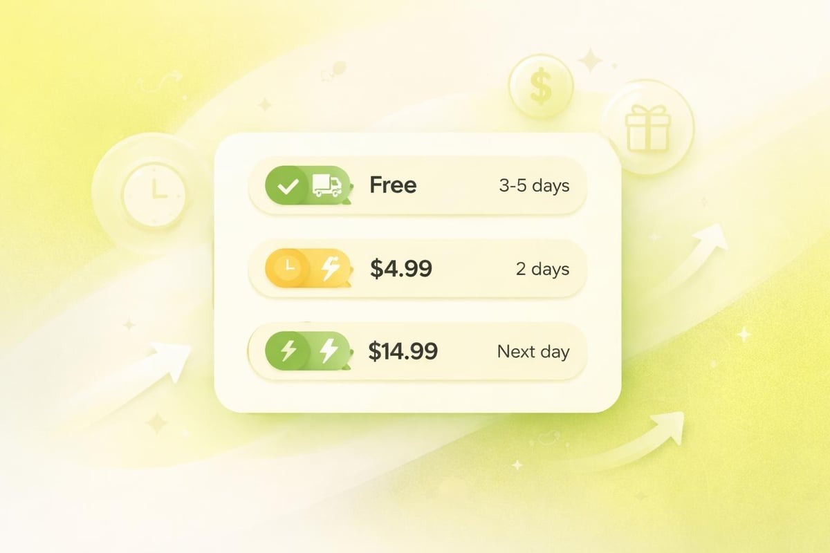
Shipping Options and Delivery Expectations
Shipping selection significantly influences purchase decisions. The Shopify checkout page must present delivery options clearly whilst managing expectations about timing and costs.
Free shipping thresholds encourage larger basket values, whilst premium delivery options cater to customers prioritising speed. Offering choice accommodates different preferences and urgencies.
Presenting Delivery Options
Clear labelling distinguishes between delivery speeds, costs, and service levels. Descriptions should include estimated delivery dates rather than vague timeframes like "3-5 days."
Effective shipping presentation includes:
- Specific delivery date ranges
- Carrier names and service levels
- Tracking availability information
- Cutoff times for same-day dispatch
- Regional restrictions or surcharges
Real-time carrier rates provide accurate costs based on delivery addresses. This transparency prevents unpleasant surprises whilst ensuring shipping charges cover actual fulfilment costs.
International Shipping Considerations
Cross-border transactions introduce complexity around duties, taxes, and extended delivery times. Shopify Markets and duty-inclusive pricing can simplify international checkout, but clear communication remains essential.
Currency conversion should happen automatically based on shipping destination. Displaying prices in local currencies reduces confusion and improves international conversion rates.
Customs and import duties deserve explicit explanation for international orders. Surprise fees upon delivery create negative experiences that damage brand reputation, even when merchants aren't directly responsible.
Performance and Technical Optimisation
Page speed directly correlates with conversion rates. Slow-loading checkout pages create anxiety and increase abandonment, particularly on mobile connections where network speeds vary significantly.
Technical optimisation of your Shopify checkout page requires balancing functionality with performance. Every script, application, and customisation adds load time that potentially costs conversions.
Checkout Speed Benchmarks
Shopify's hosted infrastructure provides solid baseline performance, but third-party applications and customisations can degrade speeds significantly. Regular performance auditing identifies problematic elements.
Target metrics for checkout performance include:
- First Contentful Paint under 1.5 seconds
- Time to Interactive under 3 seconds
- Total page load under 5 seconds
- Zero layout shifts during loading
Application bloat represents the most common performance issue. Each checkout app adds JavaScript, makes API calls, and increases complexity. Audit installed applications regularly, removing those that don't justify their performance cost.
Script and Application Management
Checkout scripts enable powerful customisations but require careful implementation. Poorly optimised scripts can block page rendering, delay interactivity, or cause errors that prevent purchase completion.
Test checkout modifications thoroughly across devices and browsers. What works perfectly on desktop Chrome may break on mobile Safari, costing conversions from iOS users who represent significant UK market share.
Reducing Cart Abandonment Through Strategic Optimisation
Understanding why customers abandon checkout helps prioritise optimisation efforts. Different friction points affect different customer segments, requiring multi-faceted improvement strategies.
Comprehensive checkout optimisation addresses both technical performance and psychological barriers to purchase completion.
Common Abandonment Triggers
Research consistently identifies several primary abandonment causes. Shipping costs, complex checkout processes, and security concerns top the list across most eCommerce categories.
Leading abandonment causes:
- Unexpected shipping costs or fees
- Forced account creation requirements
- Complicated or lengthy forms
- Payment security concerns
- Limited payment method options
- Slow page load times
- Unclear return policies
Addressing these issues systematically requires prioritisation based on your specific audience data. Analytics tools reveal where customers drop off, guiding optimisation focus to highest-impact areas.
Recovery and Retargeting Strategies
Abandoned cart emails remain highly effective recovery tools. Automated sequences remind customers about incomplete purchases whilst addressing common objections through messaging and incentives.
Three-email sequences typically outperform single messages. The first reminds about the abandoned basket, the second addresses potential concerns, and the third might include a limited-time incentive.
Exit-intent popups on checkout pages can capture departing visitors with last-minute offers or assistance. However, these must be implemented carefully to avoid adding friction to customers who simply navigated backwards to review product details.
Customisation and Branding Opportunities
Whilst Shopify limits checkout customisation for security and compliance reasons, strategic branding maintains consistent customer experience throughout the purchase journey. For those exploring custom Shopify development capabilities, understanding checkout limitations helps set realistic expectations.
Brand consistency from homepage to checkout reinforces professionalism and builds trust. Customers should feel they're completing purchases with the same brand they initially browsed, not a generic payment processor.
Available Customisation Options
Standard checkout customisation includes logo placement, colour schemes, typography choices, and background imagery. These elements should match your broader site design whilst maintaining readability and accessibility.
Typography selection impacts both aesthetics and functionality. Fonts must remain legible at various sizes, particularly for error messages and helper text that customers rely on during form completion.
Colour choices should reinforce brand identity whilst ensuring sufficient contrast for accessibility. Payment buttons particularly benefit from high-contrast colours that draw attention and encourage clicking.
Shopify Plus Advanced Customisation
Shopify Plus merchants access checkout.liquid for extensive customisation. This template language enables custom fields, dynamic content, conditional logic, and integration with external systems.
Advanced customisation possibilities include:
- Custom form fields for special instructions
- Dynamic shipping or payment method rules
- Personalised upsell or cross-sell offers
- Gift message and packaging options
- Corporate account handling
- Custom validation rules
These capabilities require development expertise and thorough testing. Checkout customisations can introduce bugs that prevent purchase completion, making quality assurance absolutely critical before deployment.
Testing and Continuous Improvement
Optimisation never ends. Customer expectations evolve, technologies advance, and competitor experiences improve. Systematic testing identifies opportunities whilst preventing regression as stores evolve.
Data-driven decision-making removes guesswork from checkout improvements. Analytics reveal customer behaviour patterns that qualitative assumptions might miss entirely.
A/B Testing Methodologies
Split testing compares checkout variations to identify higher-converting designs. Test individual elements rather than wholesale redesigns to understand which specific changes drive improvement.
Testable checkout elements:
- Button copy and colours
- Form field order and grouping
- Trust badge placement
- Express checkout prominence
- Progress indicator styles
- Error message wording
Statistical significance requires adequate sample sizes. Reaching conclusions from insufficient data leads to false positives that waste development resources on ineffective changes.
Analytics and Behaviour Tracking
Funnel analysis reveals where customers abandon the checkout process. High exit rates at specific steps indicate friction points requiring investigation and improvement.
Heat mapping and session recording tools show how customers interact with checkout pages. These qualitative insights complement quantitative analytics, revealing usability issues that numbers alone might miss.
Form analytics identify problematic fields where customers hesitate, make errors, or abandon entirely. This granular data guides field optimisation, validation improvements, and helper text additions.
Compliance and Legal Requirements
UK eCommerce operates under specific legal frameworks that checkout processes must satisfy. GDPR, consumer protection regulations, and payment industry standards create mandatory requirements beyond pure optimisation.
Legal compliance protects both customers and businesses. Violations can result in fines, legal action, and reputational damage that far outweighs any conversion gains from non-compliant practices.
GDPR and Data Protection
Marketing consent must be explicit and opt-in. Pre-checked newsletter boxes violate GDPR requirements and can result in significant penalties.
Privacy policies must be easily accessible and written in clear language. Legal jargon creates distrust whilst failing to meet transparency requirements under data protection law.
Data minimisation principles encourage collecting only information necessary for transaction completion. Requesting excessive data increases friction whilst creating additional compliance responsibilities for information storage and processing.
Consumer Rights and Transparency
Distance selling regulations require clear communication about return rights, cancellation periods, and refund processes. This information should be accessible during checkout without disrupting the purchase flow.
Terms and conditions links must appear before final purchase confirmation. Customers must have opportunity to review these documents before completing transactions.
Price transparency includes all mandatory costs. Shipping, taxes, and fees must display before payment information collection, allowing customers to review total costs before commitment.
Your Shopify checkout page represents the final, most critical touchpoint in the customer journey-where design, performance, and trust converge to either complete or lose sales. By implementing strategic optimisation across layout, forms, payment options, mobile experience, and technical performance, UK brands can transform checkout from a potential abandonment point into a conversion strength. At Futur Media, we specialise in building high-performing Shopify stores with checkout experiences that convert, combining conversion-focused design with technical excellence to help ambitious eCommerce brands maximise revenue and create seamless customer experiences that drive long-term growth.