.svg)


%201.avif)
Your homepage is the digital front door to your ecommerce business. It's where first impressions are formed, trust is built, and purchase decisions begin. For Shopify merchants competing in an increasingly crowded online marketplace, effective ecommerce homepage design isn't just about aesthetics. It's about creating a conversion-optimised experience that guides visitors seamlessly toward purchase whilst communicating brand value in seconds. Every element matters, from navigation structure to product presentation, and getting these fundamentals right can dramatically impact your bottom line.
The Strategic Role of Your Homepage
Ecommerce homepage design serves multiple functions simultaneously. It must orient new visitors, showcase your best products, communicate your unique selling proposition, and reduce friction in the customer journey.
Your homepage needs to answer three critical questions within seconds:
- What do you sell?
- Why should I buy from you?
- Where do I go next?
Visitors typically form an opinion about your site within 50 milliseconds. This means your design choices carry enormous weight. A cluttered, confusing homepage sends potential customers to competitors before they've even seen your products.
The most effective homepages balance visual appeal with functional clarity. They don't try to showcase everything at once. Instead, they create a hierarchy that guides attention strategically, highlighting key categories, bestsellers, or seasonal promotions whilst maintaining clean, scannable layouts.
Navigation Architecture That Drives Conversions
Navigation is the backbone of ecommerce homepage design. Poor navigation structures frustrate users and increase bounce rates, whilst intuitive menus make product discovery effortless.
Mega Menus for Complex Catalogues
For stores with extensive product ranges, mega menus provide clear category organisation without overwhelming visitors. These expandable navigation systems display multiple levels of hierarchy at once, allowing users to jump directly to specific subcategories.
Key elements of effective mega menu design include:
- Clear category grouping with visual separation
- Thumbnail images that aid quick recognition
- Featured collections or trending items highlighted prominently
- Maximum three levels of hierarchy to prevent decision paralysis
Avoid dropdown overload. If your mega menu requires scrolling or contains more than 15-20 options, you're likely overwhelming visitors rather than helping them.
Sticky Headers and Mobile Considerations
Sticky navigation that remains visible as users scroll keeps your menu accessible without requiring them to return to the top. This small UX enhancement can significantly reduce friction in the browsing experience.
For mobile users, hamburger menus remain standard, but ensure your most important categories are accessible within one tap. Consider featuring key product categories or your search function in the mobile header for immediate access.
Hero Sections That Convert
Your hero section occupies prime real estate and sets the tone for the entire visitor experience. This prominent area typically features large imagery, headline copy, and a primary call-to-action.
Effective hero sections share these characteristics:
- Clear value proposition that communicates what makes your brand different
- High-quality imagery that reflects brand identity and resonates with target audience
- Focused messaging that directs attention rather than trying to say everything at once
- Strong call-to-action that guides visitors toward the next logical step
Regarding carousel sliders, research from Valido AI on ecommerce homepage UX suggests avoiding auto-rotating carousels. They often reduce engagement and cause usability issues as visitors struggle to control the content they're viewing.
Static hero images with strategic calls-to-action typically outperform rotating banners. If you must use multiple hero messages, provide clear manual controls and stop auto-rotation once a user interacts with any element.
Hero Section ElementBest PracticeCommon MistakeHeadlineClear, benefit-focused, under 10 wordsVague brand slogans without contextImageryProduct-focused or lifestyle shots showing useGeneric stock photos that lack authenticityCTA ButtonAction-oriented language ("Shop Now", "Discover")Weak language ("Learn More", "Click Here")Load TimeOptimised images under 200KBUncompressed high-res files slowing page speed
Product Showcasing Strategies
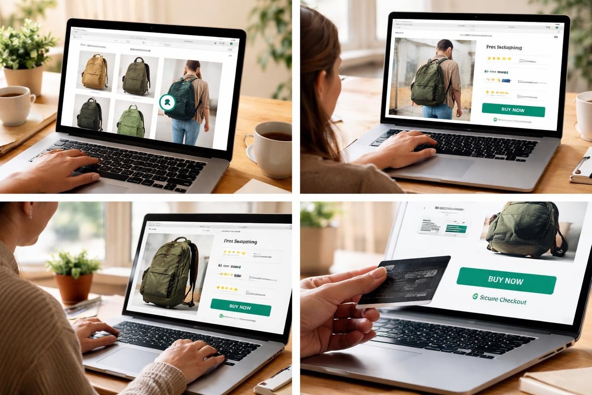
How you present products on your homepage directly influences purchase intent. Strategic product placement helps visitors discover items they're interested in whilst building confidence in your range.
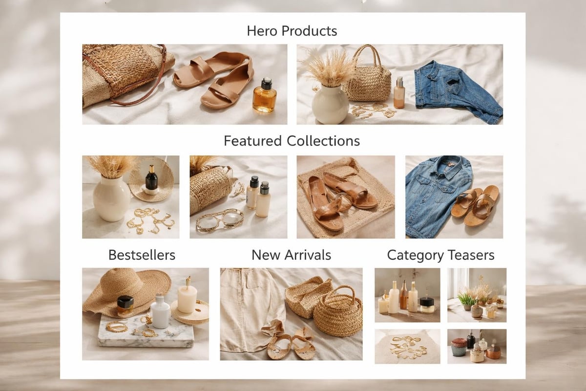
Featured Collections and Bestsellers
Highlighting bestselling products or curated collections serves multiple purposes. It provides social proof (these items sell well), reduces decision fatigue (you're recommending specific products), and creates clear pathways into your catalogue.
Consider featuring 4-8 products in your homepage showcase. This quantity provides variety without overwhelming visitors. Include clear product imagery, pricing, and quick add-to-cart functionality where appropriate.
Dynamic Product Recommendations
For returning visitors or those arriving from marketing campaigns, personalised product recommendations increase relevance. These might include recently viewed items, products based on browsing history, or items related to previous purchases.
Shopify's native features support basic personalisation, whilst apps can provide more sophisticated recommendation engines. The key is ensuring these dynamic elements load quickly and don't compromise page performance.
Trust Signals and Social Proof
Building credibility is essential in ecommerce homepage design. Visitors need reassurance they're dealing with a legitimate, reliable business before they'll share payment information.
Essential trust elements include:
- Customer reviews and ratings displayed prominently
- Trust badges highlighting secure payments, guarantees, or certifications
- Social proof such as customer counts, media mentions, or awards
- Clear contact information and customer service availability
- Professional photography and polished design that reflects quality
Don't relegate trust signals to the footer only. Strategic placement of reviews, testimonials, or trust badges near calls-to-action can reduce hesitation at critical conversion points.
Security badges from recognised providers (SSL certificates, payment processors) reassure customers their data is protected. However, avoid cluttering your design with excessive badges. Select the most recognisable 2-3 icons that resonate with your target audience.
Page Speed and Technical Performance
Even the most beautiful ecommerce homepage design fails if it loads slowly. Page speed directly impacts conversion rates, with every second of delay potentially costing you sales.
Image Optimisation
Images typically comprise the largest portion of homepage file size. Optimising these assets without sacrificing visual quality is critical.
- Use WebP format for better compression ratios
- Implement lazy loading for below-the-fold images
- Serve appropriately sized images based on device
- Compress files to balance quality with file size
Target a homepage load time under three seconds. Tools like Google PageSpeed Insights reveal specific bottlenecks affecting performance.
Code Efficiency
Bloated code, excessive apps, and unoptimised scripts slow down your store. Regular audits ensure your Shopify development remains lean and performant.
Minimise third-party scripts where possible. Each additional tracking pixel, chat widget, or review app adds load time. Evaluate whether each tool truly justifies its performance impact.
Mobile-First Design Principles
Over 70% of ecommerce traffic now comes from mobile devices. Your homepage must deliver an exceptional mobile experience, not just a responsive version of your desktop design.
Touch-Optimised Interface Elements
Mobile ecommerce homepage design requires consideration for touch interactions. Buttons and links need adequate spacing (minimum 44x44 pixels) to prevent mis-taps. Navigation menus should expand easily with thumb-friendly tap targets.
Simplify mobile layouts compared to desktop versions. What works in a wide browser window often feels cluttered on a 375-pixel screen. Prioritise the most important elements and remove secondary content that doesn't serve mobile users.
Vertical Scrolling and Content Hierarchy
Mobile users expect to scroll vertically. Design your homepage with this behaviour in mind, creating a logical flow from top to bottom that guides visitors through your key messages and product showcases.
Effective mobile homepage structure:
- Logo and navigation (sticky header)
- Hero section with clear value proposition
- Primary product category links or featured collection
- Trust signals and social proof
- Secondary product showcases
- Newsletter signup or promotional offer
- Footer with essential links and information
Avoid horizontal scrolling for critical content. If you use horizontal product carousels, ensure they're clearly indicated with visual cues and work smoothly with swipe gestures.
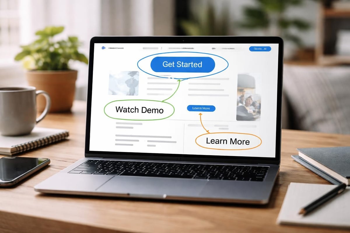
Call-to-Action Placement and Design
Your homepage can contain multiple calls-to-action, but they should follow a clear hierarchy. The primary CTA (typically "Shop Now" or category entry points) should dominate visually, whilst secondary actions (newsletter signup, customer service) complement without competing.
Effective CTA button design includes:
- High contrast colours that stand out from surrounding elements
- Action-oriented text that clearly states what happens next
- Adequate white space preventing accidental clicks
- Consistent styling that builds familiarity across the site
Research from OuterBox on homepage UX emphasises that clarity trumps creativity. Visitors shouldn't need to interpret clever copy or hunt for buttons. Make desired actions obvious and easily accessible.
Position your strongest CTAs above the fold where they're immediately visible. However, don't neglect opportunities lower on the page for visitors who scroll. Repeat calls-to-action strategically throughout the homepage for maximum conversion potential.
Search Functionality and Site Search Optimisation
A prominent, functional search bar is essential for product discovery. Many visitors prefer searching to browsing, especially when they know what they want.
Position your search bar in the header where users expect to find it. Make it visually distinct and large enough to accommodate typing comfortably. On mobile, consider making search a primary navigation option rather than hiding it in menus.
Autocomplete and Search Suggestions
Implementing autocomplete functionality helps visitors find products faster whilst reducing typos and spelling errors. As users type, displaying popular searches, product categories, or specific items guides them toward relevant results.
Advanced search features might include:
- Product image thumbnails in search suggestions
- Category filtering during search
- Recent search history for returning visitors
- Trending or popular searches to aid discovery
The goal is reducing friction between intent and discovery. Every extra step or failed search attempt increases the likelihood visitors abandon your site for competitors.
Content Blocks and Storytelling
Beyond product listings, your homepage can incorporate content blocks that tell your brand story, highlight unique selling points, or educate visitors about your offerings.
Strategic content blocks might include:
- Brand mission or values statements
- Manufacturing process or quality guarantees
- Sustainability commitments or social responsibility
- Customer service promises and policies
- Expert advice or category education
These elements differentiate your store from competitors selling similar products. They build emotional connection and provide compelling reasons to choose your brand beyond price or selection.
Keep content blocks concise and scannable. Visitors won't read lengthy paragraphs on a homepage. Use bullet points, bold text for emphasis, and strategic imagery to communicate key points quickly.
Footer Design and Information Architecture
Whilst often overlooked, your footer plays a crucial role in ecommerce homepage design. It provides essential information without cluttering primary content areas and serves as a final conversion opportunity for visitors who scroll through your entire homepage.
According to ECORN Agency's ecommerce design best practices, conversion-optimised footers balance comprehensive information with clean organisation.
Effective footer sections include:
Footer SectionPurposeKey ElementsCustomer ServiceAddress common questions and concernsContact information, FAQs, returns policy, shipping infoAbout & PoliciesBuild trust and transparencyAbout us, privacy policy, terms of serviceProduct CategoriesProvide additional navigation pathsKey category links, bestsellers, new arrivalsNewsletter SignupCapture leads for email marketingEmail input, compelling incentive, privacy reassuranceSocial ProofExtend brand presenceSocial media links, payment icons, certifications
Avoid footer bloat. Whilst comprehensive, your footer shouldn't overwhelm with excessive links or information. Organise content into clear columns with descriptive headings that help visitors locate what they need quickly.
Personalisation and Dynamic Content
Advanced ecommerce homepage design incorporates personalisation based on visitor behaviour, location, or previous interactions. This creates more relevant experiences that increase engagement and conversion.
Personalisation opportunities include:
- Geographic targeting showing local shipping times or regional promotions
- Returning visitor recognition displaying recently viewed items
- Browse behaviour adaptation highlighting categories users show interest in
- Customer segment tailoring presenting different content to new vs returning customers
Implement personalisation thoughtfully. Over-personalisation can feel invasive, whilst poorly executed dynamic content might show irrelevant products or create confusion. Start with simple implementations and measure impact before expanding.
For Shopify stores, Shopify CRO services can help identify which personalisation strategies drive meaningful results for your specific audience and product range.
Seasonal Adaptations and Homepage Flexibility
Your ecommerce homepage design should accommodate seasonal changes, promotional periods, and evolving business priorities without requiring complete redesigns.
Build flexibility into your homepage structure through modular content blocks that can be easily updated, reordered, or replaced. This might include:
- Hero banner rotation for campaigns or seasonal messaging
- Featured collection sections that highlight current promotions
- Flexible product showcases easily updated with trending items
- Promotional banners with countdown timers for limited offers
Planning for change during initial Shopify web design development saves time and resources when you need to refresh content for peak seasons like Christmas, Black Friday, or category-specific events.
A/B Testing and Continuous Optimisation
Effective ecommerce homepage design is never truly finished. Continuous testing and refinement based on real user data drives ongoing improvement in conversion rates and user experience.
Elements worth testing include:
- Hero section messaging and imagery variations
- Product showcase layouts and featured items
- Call-to-action button colours, text, and placement
- Navigation structure and category organisation
- Trust signal placement and prominence
Use tools like Google Optimize or dedicated conversion rate optimisation platforms to run structured A/B tests. Focus on one variable at a time to clearly identify what drives improvement.
According to Drip's homepage best practices guide, maintaining design simplicity whilst testing variations helps you understand what resonates with your audience without introducing multiple variables simultaneously.
Document your findings and build a knowledge base of what works for your specific audience. Customer behaviour varies across industries, price points, and target demographics. What works for one store might not translate to yours.
Accessibility Considerations
Inclusive ecommerce homepage design ensures all visitors can navigate and purchase from your store, regardless of disabilities or assistive technology use.
Key accessibility practices include:
- Sufficient colour contrast between text and backgrounds (minimum 4.5:1 ratio)
- Alternative text for all images describing content and function
- Keyboard navigation support for all interactive elements
- Screen reader compatibility through proper heading hierarchy and ARIA labels
- Visible focus indicators showing which element is currently selected
Accessibility isn't just ethically important; it's legally required in many jurisdictions and expands your potential customer base. Implementing these standards during initial development is far easier than retrofitting them later.
Analytics and Performance Tracking
Understanding how visitors interact with your homepage informs design decisions and reveals optimisation opportunities. Implement comprehensive analytics tracking to monitor key metrics.
Essential homepage metrics include:
- Bounce rate (percentage leaving without interaction)
- Time on page and scroll depth
- Click-through rates on CTAs and product links
- Exit pages showing where visitors leave
- Conversion rate from homepage to purchase
Heatmapping tools like Hotjar or Crazy Egg visualise where visitors click, how far they scroll, and which elements attract attention. This qualitative data complements quantitative analytics, revealing behaviour patterns that numbers alone might miss.
Regular performance reviews should examine both technical metrics (load time, mobile performance) and user engagement indicators (bounce rate, conversion paths). This comprehensive view highlights both technical issues and UX problems requiring attention.
Integration with Broader Store Design
Your homepage doesn't exist in isolation. It must integrate seamlessly with Shopify collection pages, product pages, and checkout experiences to create a cohesive customer journey.
Maintain consistent design language across all pages through shared colour schemes, typography, button styles, and layout principles. This consistency builds familiarity and trust whilst reducing cognitive load as visitors navigate your store.
Consider the full customer journey when designing your homepage. Where do first-time visitors typically go next? What information do returning customers need? How can your homepage better support different visitor intents and purchase stages?
The most effective ecommerce stores treat their homepage as one touchpoint in a larger ecosystem rather than a standalone page requiring constant attention at the expense of other critical areas.
A well-executed ecommerce homepage design balances aesthetic appeal with strategic functionality, guiding visitors toward conversion whilst communicating brand value efficiently. For Shopify merchants looking to maximise their homepage performance, professional expertise can identify opportunities specific to your business and audience. Futur Media specialises in building conversion-focused Shopify stores that turn visitors into customers through data-led design, technical optimisation, and strategic UX improvements tailored to ambitious UK brands.